An architectural icon, translated into print

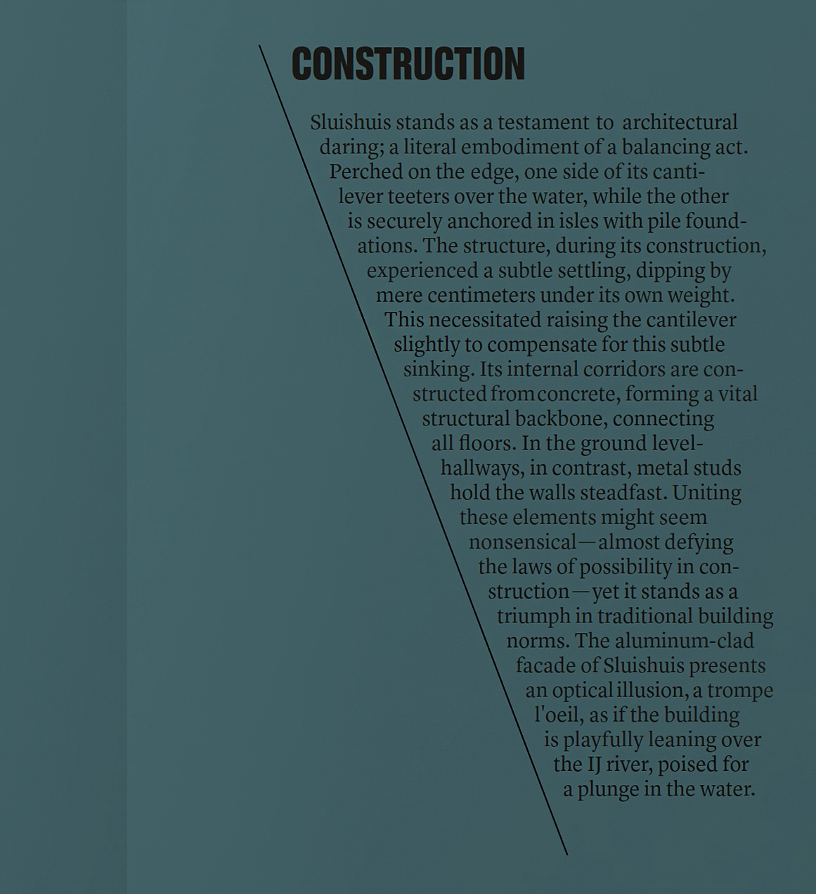
Majestic, perception-defying, and an exercise in the impossible. Sluishuis embodies bold architectural thinking and gives Amsterdam’s IJburg the striking identity it deserves. The residential complex comprises 442 apartments, mixing rental and owner-occupied homes for a diverse range of residents. Each apartment is accessible through a central courtyard, where the cantilever and the water form a welcoming entrance. Every home benefits from optimal daylight and views, made possible by Sluishuis’s distinctive double-cut form.
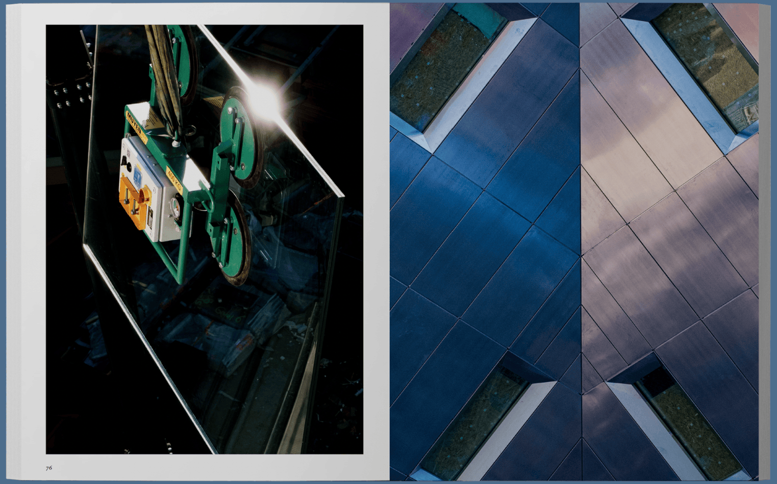
Sluishuis offers a contemporary interpretation of the traditional Amsterdam building block, uniquely tailored to its waterside setting. One side lifts above the water, allowing it to flow into the courtyard, while the other steps down in a gesture of openness with lush green terraces. For developers Besix RED and VORM, MENDO produced a publication that chronicled the building’s evolution through photography and interviews, tracing its path from construction to completion.
The slanted line on the cover returns as an iterative visual signature and reappears in the angled structure of the chapter introductions. Every detail was intentional and considered, much like the building itself.
I oversaw the publication and design direction, building on the photo series, commissioning a writer for interviews, and shaping the editorial structure and including sub editing. I managed design, budget, lithography, and production, selecting the print partner and ensuring every element aligned with the project’s vision up to the launch.
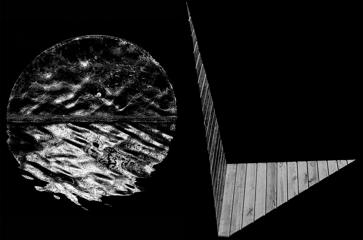
From every perspective, Sluishuis reveals itself anew. Whether seen from the dyke, motorway, or bridge, while crossing the jetties or walking the public route over its roof, or even from above, the building continues to surprise. This perspective became the guiding thread in my approach to the book. The surrounding colours were absorbed directly into the design language, from weighty concrete tones to natural greenery.
Sluishuis Development CV
BESIX RED
VORM Ontwikkeling
Language: English
Extent: 328 pages
Dimensions: 24 x 31 x 2.48 cm
Weight: 2400 grams
Publisher: MENDO
ISBN: 9789464914092
Publishing
Editorial direction
Editing
Sub-editing
Publisher: MENDO
Main photographer: Troy Martin
Design: Céline Hurka
Writer: Aaron Allan Mitchell
Sub-editor: Hayley Daen
Lithography: Daniël Siegersma
Printer: ORO